 Analysis byWeUseApps
I like photo-editing apps best when they help me make one clear creative choice at a time. MangaNest is aimed at that kind of casual, manga-inspired editing: it lets me start with a photo and work on its crop, filters, text, and drawing rather than asking me to learn a full illustration program. That makes it appealing for quick comic-style posts, character portraits, and playful edits, while also setting a sensible expectation: it is a lightweight creative tool, not a complete comic-production studio.
As a free comics-category app from Quanettema, it has an average rating of 4.6 from around 3,700 ratings and over 100,000 installs. It is rated Teen, and version 1.6.21 is listed for devices running Android 7.0 or later. Those figures suggest a well-used option, but they do not tell me whether it suits a particular project. The more useful question is whether its focused set of editing tools fits the way you want to make images.
Start with one photo and a simple visual idea
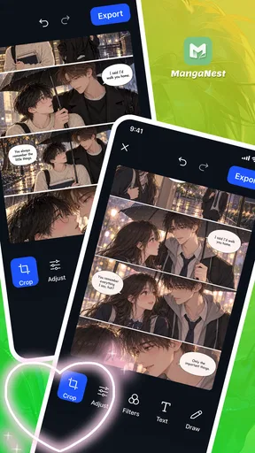
The most dependable way to use the app is to decide what the image needs before reaching for every available effect. I would begin with a photo that already has a clear subject, crop away distractions, and then try a filter that supports the mood. A short caption or a few drawn marks can finish the image. This order matters: adding text before settling the crop can leave a caption cramped or oddly placed once the composition changes.
That basic workflow suits a lot of everyday tasks. You might want to turn a pet photo into a comic-like reaction image, make a portrait feel more illustrative, or add a handwritten note to a picture for a small group chat. In each case, the original photo does much of the storytelling. The app’s value is in helping you push its presentation toward manga-inspired art without requiring you to draw the entire scene from scratch.
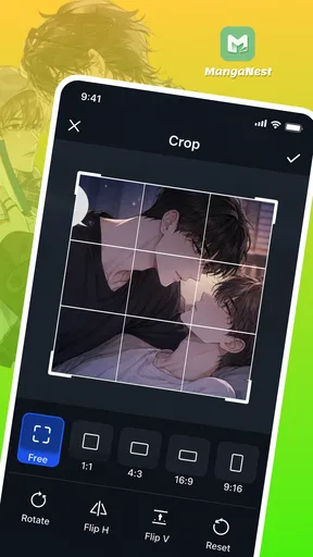
I would treat cropping as a design step, not just a cleanup tool. A tighter crop can make an expression feel more dramatic, while leaving room around a face gives text somewhere to sit. Before applying a strong filter, I would also check whether the important details in the source image are already easy to read. If a photo is dark, busy, or out of focus, decorative editing may make it more stylized without making it clearer.
The controls described for MangaNest are approachable in concept: adjust the frame, choose a filter, place text, and draw. That is a narrower proposition than a layered graphics editor, and for quick experiments I see that as a benefit. There is less to learn before making a first version. The trade-off is that people who expect intricate panel layouts, precise lettering tools, or a deep illustration workflow should not assume those are part of the experience.
Build a repeatable editing habit
For a small series of images, consistency usually matters more than adding a new effect to every frame. I would choose a general crop style and visual mood first, then keep those choices steady while editing the rest. For example, a set of character reactions can feel connected if the faces occupy similar space and the captions use a similar tone. That approach makes simple edits look deliberate without relying on elaborate tools.
A useful habit is to keep the first pass restrained. Crop, test a filter, and add only the text or drawing that helps someone understand the image. Then pause and look at the result at the size where it will actually be seen. Small lettering that seems clear while editing can become hard to read on a phone screen; a decorative stroke can also compete with a facial expression. A quick readability check often improves the finished image more than another filter does.
For a casual comic-like post, I would use the text as a concise cue rather than trying to fit a full conversation into one picture. A short reaction or sound effect leaves the artwork room to breathe. If the idea needs several beats, it may be better to make separate images or use an app designed around comic pages instead of forcing a sequence into a single-photo editor.
Check the creative choices before finishing
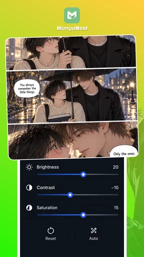
The settings worth checking are the ones that affect the image’s clarity and consistency: how tightly it is cropped, whether the filter overwhelms the subject, and whether added text or marks remain legible. I would compare a filtered result with the original before committing to a strong look. A manga-inspired treatment can be fun, but if it removes the contrast that makes a face or object recognizable, the effect is working against the image.
Text placement deserves particular attention because it changes how a viewer reads the picture. A caption placed over a busy area can be difficult to follow, even if the wording is good. I would look for a relatively quiet patch of the photo, keep the message brief, and avoid covering the feature that gives the image its personality. The same principle applies to drawing: a few intentional accents can guide the eye, while too many marks can make a small image feel cluttered.
One practical trade-off is that photo-based editing depends on the starting material. MangaNest can help reshape a photo’s presentation, but it cannot make every source image equally suitable for comic styling. A clean portrait gives filters and drawing a clearer foundation than a crowded scene with several competing subjects. When I have a weak source image, I would spend time choosing a better crop before trying to rescue it with effects.
Another helpful decision is to think about the destination before editing. A picture meant for a quick message can tolerate a looser, more playful finish; an image meant to be reused in a polished project needs more consistency and careful lettering. Since the app is centered on editing photos with a handful of creative tools, I would use it for fast, self-contained artwork rather than assume it will manage a long-form comic from concept to final page.
Where speed helps, and where it stops
The faster pattern is to make a small number of decisions in the same order each time: compose the crop, settle the visual treatment, add the message, and draw only what the image still needs. This avoids bouncing between tools and reduces the temptation to keep layering effects just because they are available. It is a repeatable habit, not a hidden shortcut, and it works especially well when making several related reaction images.
Compared with a general-purpose photo editor, MangaNest has a more specific creative aim. A broad editor may be the better choice when you need extensive correction, precise control over many visual elements, or a wider set of finishing options. Compared with a dedicated comic-making app, MangaNest is more naturally suited to turning an existing photo into a stylized image than building a page with a planned sequence of panels. The right alternative depends on whether your starting point is a photograph, a blank canvas, or a full story layout.
That distinction also helps answer whether it is suitable for beginners. If you are comfortable choosing a photo and experimenting with a crop, filter, text, or drawing, the focused workflow is easy to understand. If you want detailed control over every part of an illustration, or need a structured way to arrange a multi-panel story, a more specialized tool will likely feel less limiting. I would not choose this app on the assumption that a manga-inspired look automatically means professional comic-making features.
For regular use, I would keep a few personal rules: use one visual direction per set, make captions easy to scan, and stop editing when each addition has a clear purpose. These habits help avoid the common problem of a photo becoming a pile of filters, words, and doodles. They also make it easier to reproduce a look later, even when the app itself is not being used as a full design system.
A good fit for playful photo edits, not every comic project
My overall view is that MangaNest makes the most sense for people who want to add a manga-flavored finish to photos without taking on a large editing workflow. Its combination of cropping, filters, text, and drawing covers the core actions behind a quick comic-style image. I would recommend trying it for character reactions, casual social posts, and small creative experiments where the photo is already doing most of the work.
I would skip it if the main goal is to produce polished pages with multiple panels, build complex illustrations from a blank canvas, or exercise fine-grained editing control. In those situations, a dedicated drawing or comic-layout app is a more appropriate starting point. The Teen content rating is also worth keeping in mind when choosing an app for a younger user or a shared device.
For someone undecided, the best first test is straightforward: pick a well-lit portrait, make a crop that gives the face room, try a restrained filter, and add one short caption or drawn accent. If that small workflow feels enjoyable and gets you close to the style you want, the app is serving its purpose. If you find yourself wishing for page layouts or detailed illustration controls, that is a useful sign to move to a more specialized alternative.
In short, I see this as a focused photo editor with a clear creative use, rather than a complete manga studio. Its free price makes it easy to explore, and its appeal lies in turning a familiar picture into something more expressive with a few approachable choices. The best results come from a good source photo, a consistent editing habit, and knowing when to stop before the image gets crowded.
What we like
- Offers a dedicated space for browsing digital comics.
- A lightweight app can suit devices with limited storage.
- Comic-focused navigation makes series easier to discover.
- Useful for readers who want comics in one app.
- A compact option for casual reading on the go.
What could be better
- The available catalog may vary by region.
- Some titles may require an account to access.
- Reading options may feel limited for advanced users.
- Availability of offline reading is not guaranteed.
- The app may include ads or in-app purchases.